Skate Drop
Skate Drop is the first skateboard shop in their city located in southern Ontario to offer on-demand skateboard products at the consumer's door. They have operated within a basement for a few years and want to take their brand to the next level by opening a physical location to better serve their consumers.

Logo
The logo before did not resonate with the brand's values of inclusiveness and approachability. The original logo is tough to read which becomes an issue when the consumer can't recognize the logo.
The new logo is bold, and legible and utilizes the same pin drop drop motif to communicate the skateboard shop is mobile. The blue was slightly modified to follow recent design trends that favour bold pops of saturated colour.
Before

After


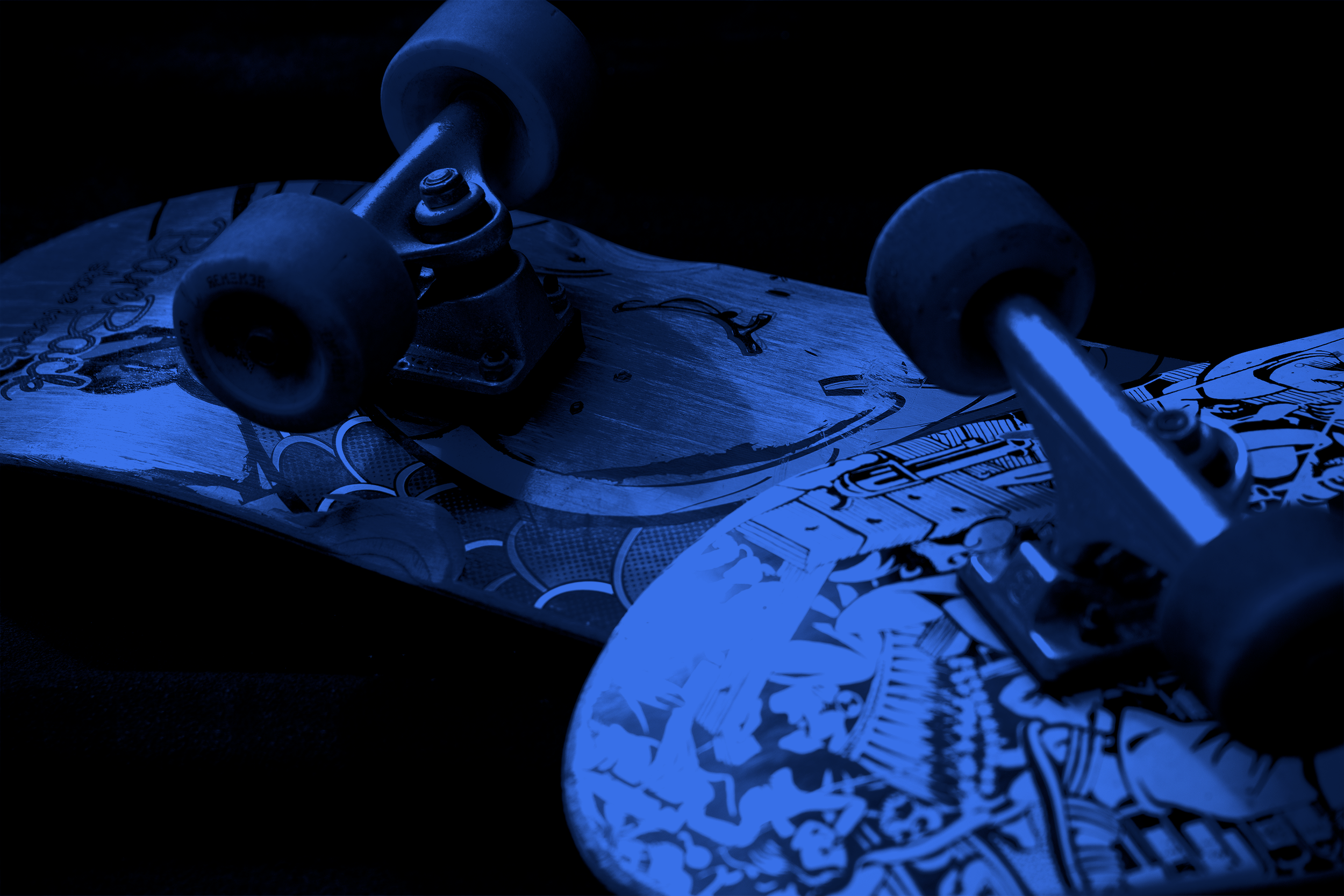
Social Meida
The social media strategy is to be as personable as possible while displaying products that the shop would like to highlight. All product photos are shot outside focusing on concrete as a backdrop. This adds dimension and texture to each post. Announcement posts utilize the lifestyle and culture of skateboarding to help the viewer focus more on the text than the aesthetics of the photo.


Research
I started by focusing on the logo. After creating five new logos, the client and I decided it would be best to compile data in the form of a survey to better understand the consumer's values and thoughts on the previous and new logo. After compiling this info, we moved ahead with the most well-received logo and created storytelling, omnichannel, and M.V.V. statements as a brand book. Some omnichannel touchpoints include a newsletter, physical merchandise, video content, and more.
While designing the logo, we decided to ask questions to help us effectively understand the wants, needs and values of the existing consumer base when designing the new logo and creating a brand guidelines book. The results helped us understand that 25% of the consumers felt that the current logo felt satanic with the star at the top of the previous logo, which does not align with the current target demographic of family inclusion. Another 25% felt the logo was disconnected from the current brand’s voice.